2018-Dec-18
Hotter summers projected; how it may affect you on the Bay
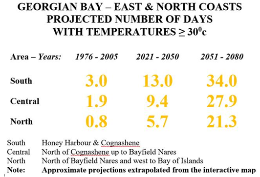
What are the impacts on Georgian Bay cottagers? Will getting away to the Bay in the hot Canadian summers be more valued by future generations? How many days will “seasonal cottages” be open on the Bay of the future? Will there be ice on the Bay in the winter? How will more hotter days affect climate-resistant cottage design? View our approximate calculations on the projected number of very hot days for various parts of the Bay and find more information…

https://climateatlas.ca/map/canada/plus30_2030_85#grid=422&lat=45.04&lng=-78.4&z=7
As Georgian Bay residents, we need to address the challenges of hotter summers and the need to reduce our carbon footprint. Utilizing solar power to run air conditioners, rather than drawing excessive power from the grid would be one example. Maintaining a simple cottage life-style that uses minimal power would be another.
Mapping Canada’s climate future
The Climate Atlas of Canada shows users what trends to expect in their communities as a result of climate change

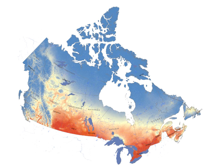
Adapted from the interactive Climate Atlas of Canada, this map shows the projected number of days with temperatures of 25 degrees Celsius or higher per year by the end of this century if global warming continues unchecked, with dark red representing 100+ days. Summers in southern Canada could see nearly twice as many hot-weather days as they did at the end of the last century, while Yellowknife and other places in the southern Arctic could see four times as many 25C-or-hotter days. (Map: Chris Brackley/Canadian Geographic)
Within the next 60 years, Ottawa will experience nearly 40 more days of 30-plus degree heat per year than the city saw between 1976 and 2005. Winters in Pangnirtung, Nunavut, will have 10 times fewer -30 C days and Winnipeg will have four times as many scorching hot days compared to the same time period. It’s stark, it’s drastic and it’s Canada’s future, according to the interactive Climate Atlas of Canada.
Researchers, geographers and programmers at the Prairie Climate Centre in Winnipeg have mapped the impacts of climate-change-causing greenhouse gas emissions on Canada, based on data from the Intergovernmental Panel on Climate Change. The map lets users toggle between 30-year intervals to see how temperatures, precipitation and growing conditions will evolve during the next half-century.
When using the tool, “one of the first things that people do is go to where they live,” says Ian Mauro, the Prairie Climate Centre’s director of communications. He says that by localizing the future effects of climate change, the map will motivate people to adapt their habits and prepare. “It’s not just global climate models and a hot earth. It’s ‘Oh, that’s my backyard,’ and ‘Oh, I better start thinking about this.’ ”
The atlas offers both low- and high-carbon projections for the country’s climate future. The lower end models a future based on emissions levels falling to two-thirds of 2005 levels by the middle of the century; the high projection represents the outcome if global emissions continue growing at their current rate. “It’s the worst-case scenario,” says Danny Blair, the Prairie Climate Centre’s director of science. “We hope.”
Blair, who helped collect and analyze the data, was stunned when he first saw the results of future 30-plus degree days in the Prairies. (The map at top shows hot weather summer days* under a high-carbon scenario for 2051 to 2080.) “That map is just shocking.”
Despite stark projections, “we’re not damned to the high-carbon future,” says Mauro. He and Blair hope that the map will help people plan ahead and adapt.
Videos that accompany the atlas showcase communities shifting towards greener living already. The Montana First Nation in Alberta started up a solar panel-installation company when production from their oil and gas wells began to slow, and Tatamagouche, N.S. is building wind turbines to power their town. Mauro and Blair hope that other communities across the country will be inspired to join in.
